



Destination weddings through an explorer's lens
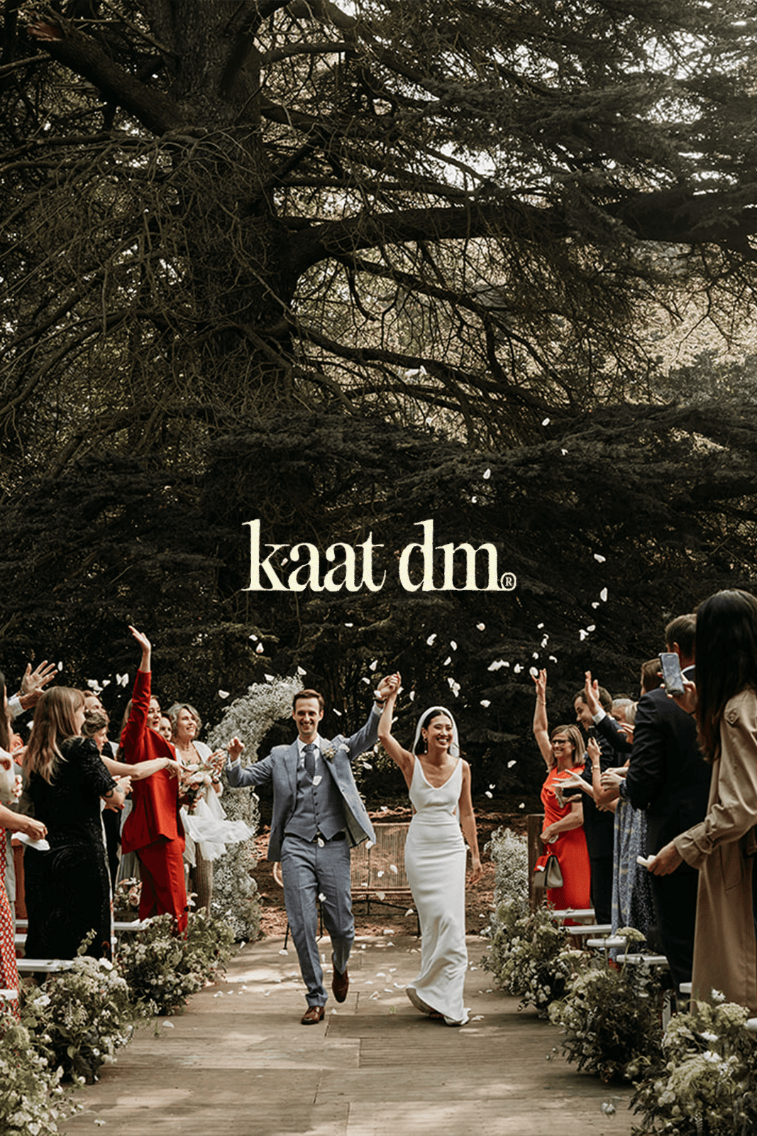
Kaat DM’s new identity was designed to bring her adventurous character and high-end positioning into one coherent visual world.
A nostalgic, vintage-inspired typeface forms the heart of the brand, recalling old hiking maps, travel archives and classic outdoor advertising, while the flowing lowercase wordmark keeps the identity elegant, personal and approachable.
Earthy greens, warm neutrals and a bold yellow accent connect the system to nature without falling into predictable rustic aesthetics. Coordinates became a recurring graphic device, turning every destination into part of the story while reinforcing Kaat’s international ambitions. The registered trademark adds a subtle layer of confidence, positioning Kaat DM as an established name rather than an emerging photographer.
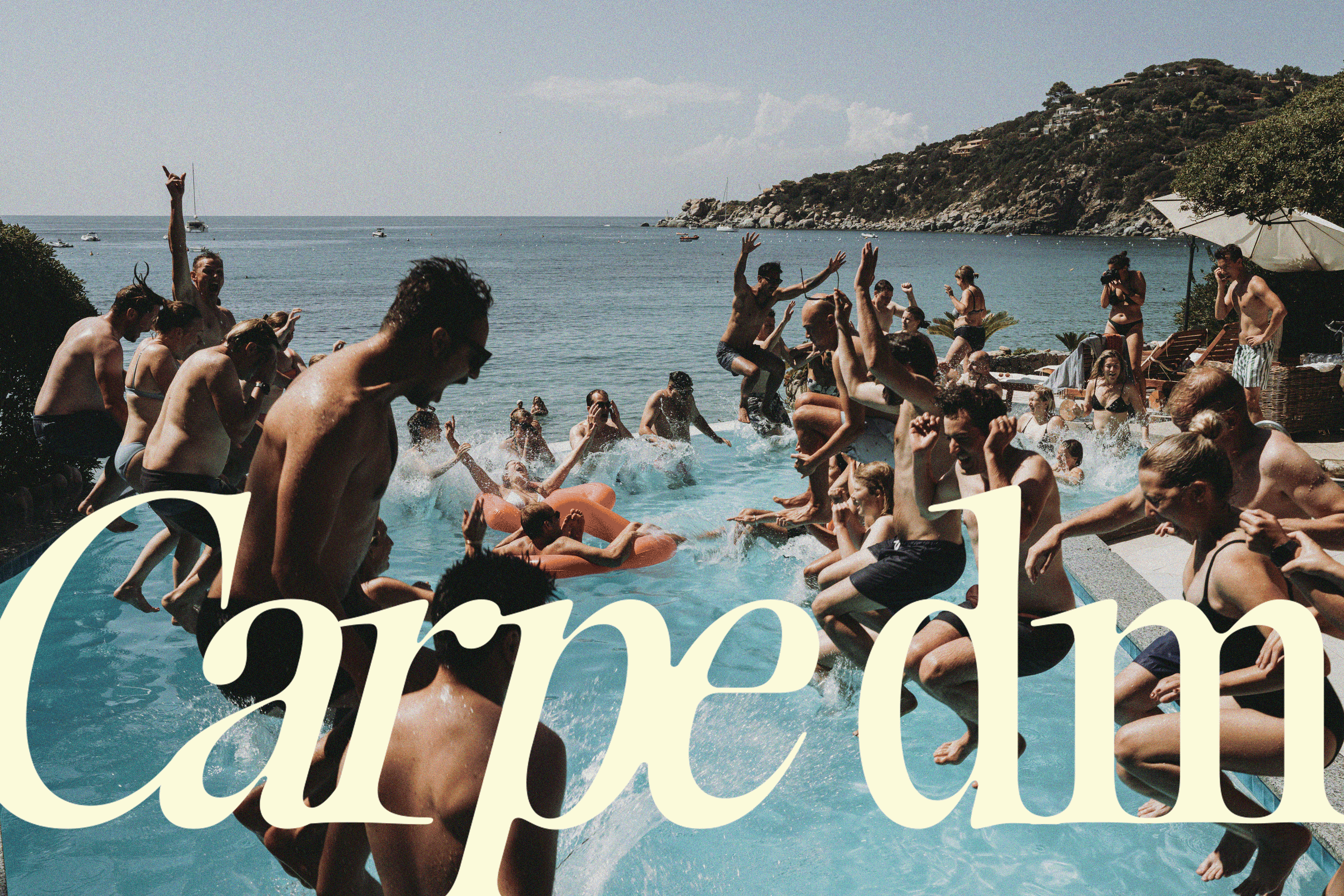
With Carpe DM, we created a playful expression that combines her name with the spirit of carpe diem and captures the spontaneous, go-for-it attitude at the centre of her work.
Together, these elements create a brand that feels adventurous yet refined, nostalgic yet contemporary and fully equipped for the European high-end (elopement) wedding market.
(client)
Kaat DM Photography
(year)
2024
(services)
branding
(images)
Kaat DM Photography