



An allround approach for a holistic coach
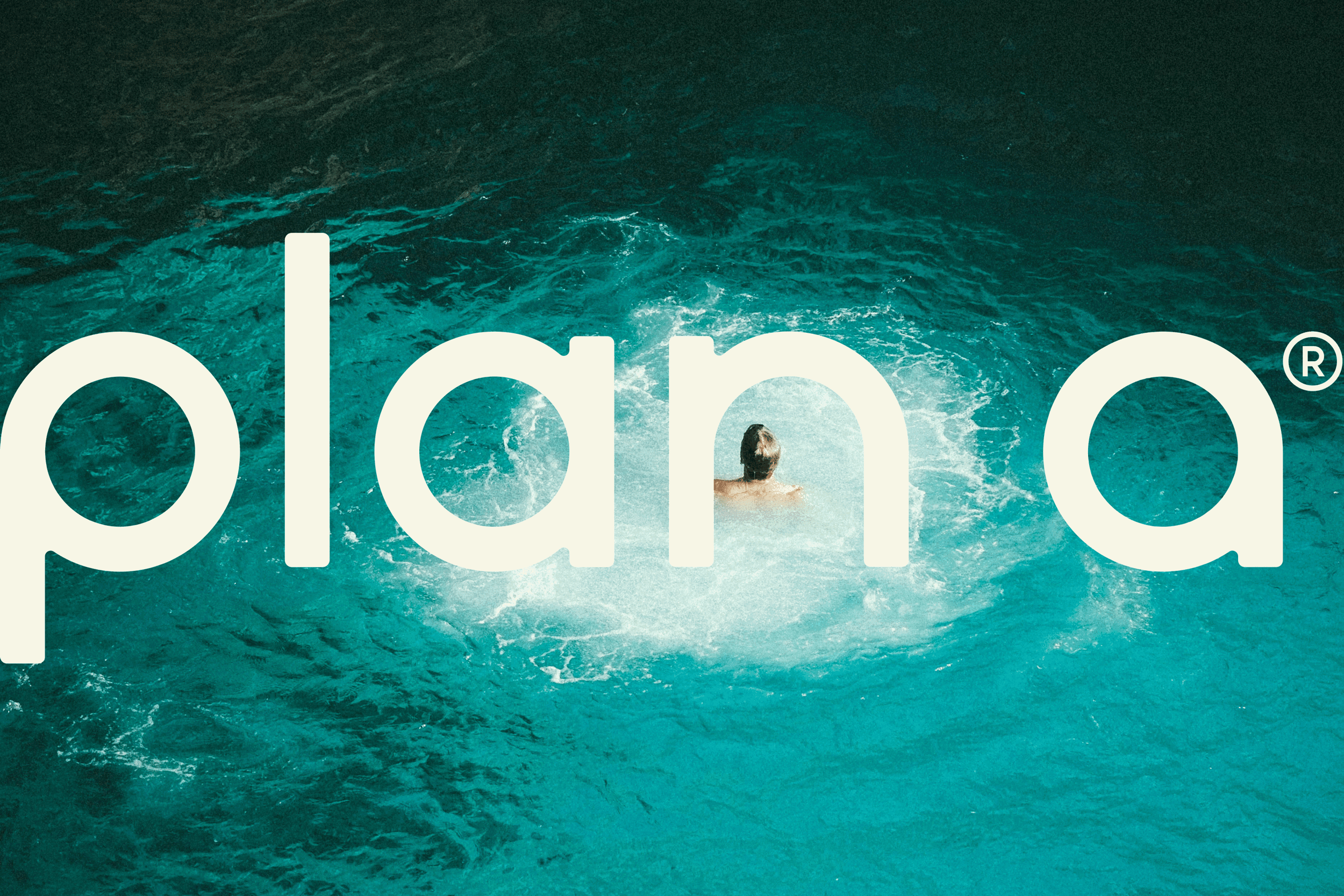
Plan a® needed a professional, high-end identity that felt trustworthy without slipping into the polished clichés of the wellness industry.
During a visual exercise, Bart revealed a strong fascination with the shapes and typography strongly associated with the Bauhaus movement. What first looked like an aesthetic preference turned out to reflect something deeper: the movement’s focus on clarity, structure, innovation and bringing different disciplines together closely matches the way Plan a® approaches health, coaching and performance.
That connection shaped a clean, geometric identity, balanced by a warmer colour palette and a flexible set of symbols for many themes such as sleep, movement and mindset.
The result is a clear and practical brand system that supports Plan a®’s ambitions, while still feeling rooted in Bart’s own character and way of working.
(client)
Plan a®
(year)
2024
(services)
branding
(images)
Adam Davis, Julia Joppie, Dmitrii Vaccinium